-
Type:
Suggestion
-
Resolution: Answered
-
Component/s: None
NOTE: This suggestion is for Confluence Cloud. Using Confluence Server? See the corresponding suggestion.
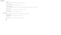
The UI for setting the e-mails is difficult to read and understand. The wording of the settings is too vague and both the "watches" and "all content" are in a single list making it confusing. See the attached screenshot from Confluence 3.5.7.
It would be good to have separate sections for subscriptions and notification settings. Maybe something like this:
Subscriptions
- Receive a daily digest of all changes
- Receive notifications for changes made by people in your network
- Receive notifications for all new blog posts
Automatic watching
- Automatically watch content you edit or comment on
Notifications
Notification type: HTML | Text
- Include the changed content in the e-mail (HTML only)
- Include the entire content in the e-mail (HTML only)
- is related to
-
CONFSERVER-22887 Improve UI for email notification settings and subscriptions
- Closed
- relates to
-
CONFCLOUD-5566 Personalized daily notifications
- Gathering Interest
