-
Type:
Suggestion
-
Resolution: Answered
-
Component/s: None
NOTE: This suggestion is for Confluence Cloud. Using Confluence Server? See the corresponding suggestion.
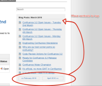
For the new slimmer blog design introduced in CONF-18738:
The controls are at the bottom, below the list of blog posts for the month.
They should be at the top instead, so that the position is unaffected by the number of blogs. In months with lots of blog posts, the users may have to scroll down to find the controls with the current design.
- is related to
-
CONFSERVER-19259 Slimmer blog design should have controls to croll months at the top instead of at the bottom
- Closed
