-
Type:
Suggestion
-
Resolution: Duplicate
-
None
-
Component/s: None
-
None
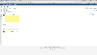
As much as I like the stash UI in general, I have a couple of issues that consistently bug me. I've attached a screenshot of my typical use case - window maximised on my 27" monitor.
- The sidebar collapses the actions despite having an immense amount of space available (I know this is duplicate and logged elsewhere, but I wanted to highlight how silly it looks here)
- Nowhere on this screen is the repository name visible. Yes it's available in a mouse over on the project icon, but that's not obvious nor convenient.
- duplicates
-
BSERV-5003 Put all buttons on collapsed sidebar (no hiding)
- Closed
