-
Type:
Bug
-
Resolution: Fixed
-
Priority:
Medium
-
Affects Version/s: 8.18.0
-
Component/s: Accessibility
-
Severity 3 - Minor
Issue Summary
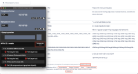
The color alone is used to distinguish links present in the footer section of the page from surrounding text.
Steps to Reproduce
- Open the "Projects" page.
- Navigate to the links present in the footer section.
- Observe that only color is used to distinguish the links from the surrounding text.
- Use CCA testing tool to check the contrast between the link text and the surrounding text.
- Observe that links have a low contrast ratio with the surrounding text.
Screenshot

Actual Results
Color #616F86 alone is used to distinguish "Atlassian Bitbucket", "Documentation", "Request a feature" and so on links present in the footer section from the #616F86surrounding text. These mentioned links have a low contrast ratio of 1:1 with the surrounding text. This will make it difficult for low vision users and those with color-blindness to distinguish mentioned links within the block of text.
Expected Results
Users should be able to easily identify the mentioned links within the block of text.
Apply the following changes:
- To make it easy for all users to recognise the mentioned links the best practice is to persistently underline them or provide any other visual cue such as formatting the text as bold or italic.
- If the above solution is not feasible, change the color of the mentioned links so that they have a contrast ratio of at least 3:1 with the surrounding text.
Workaround
Not Available.
Environment
MacBook Pro (14-inch, 2021)
macOs Sonoma 14.2.1
Chrome - Version 121.0.6167.85 (Official Build) (arm64)
Firefox- Version 92.0 (64-bit)
Safari- Version 17.2.1 (19617.1.17.11.12)
JAWS- Version 2022
NVDA- Version 2021.2
Voiceover - Version Latest
- mentioned in
-
Page Loading...
