-
Type:
Suggestion
-
Resolution: Won't Fix
-
Component/s: Product - Global Navigation
Hi,
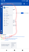
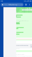
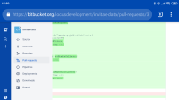
When I check my Pull Request on mobile Android, I have always this annoying left sidebar menu with the action available on the current repository where I'm which occupied almost all my screen. (See the picture with this sidebar circle in red) So it's really no practical for using bucket repository view from mobile.
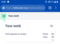
It would be nice to have a button which allows us to hide/show the left sidebar. (See the button I'm talking about on the picture underlined in green).
Thanks you.


