-
Type:
Suggestion
-
Resolution: Answered
-
Component/s: None
-
Environment:JIRA 4.2.2 and GH 5.4
NOTE: This suggestion is for JIRA Software Cloud. Using JIRA Software Server? See the corresponding suggestion.
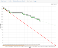
The Statistics Burndown Chart has way too many points when viewing a release version daily that spans many months.
I have attached a screenshot of burndown chart by story points for our 2.4.0 release.
You can see that the graph has a point for each day and is hard to read.
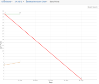
I have attached a burndown chart by story points for a two week sprint and the chart has fewer points as the period is shorter.
Could we choose a different period to display the points for a release burndown (maybe weekly and monthly)?
- is related to
-
JSWCLOUD-2275 Comprehensive Charts
- Closed
-
JSWSERVER-2895 The Statistics Burndown Chart is too granular for a release duration greater then a few months.
- Closed


