Details
-
Suggestion
-
Resolution: Fixed
Description
NOTE: This suggestion is for Confluence Server. Using Confluence Cloud? See the corresponding suggestion.
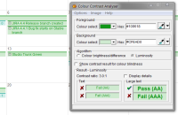
I find the colours in team calendar really hard to read. eg. in the attached screenshot, all the items are blue-on-blue or green-on-green and it's muddy. The blue ones are particularly bad, I tend to lean in to my monitor to read those.
Basically I'd suggest making the foreground colours darker so the text stands out on top of the background colour. Using the CCA provides an easy way to determine if the colours have enough contrast - http://www.paciellogroup.com/resources/contrast-analyser.html
Attachments
Issue Links
- relates to
-
CONFCLOUD-51049 Bad colours make Calendars hard to read
- Closed
