-
Suggestion
-
Resolution: Won't Fix
-
None
-
None
-
Firefox 3.6 beta 5
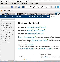
When displaying a page in Confluence, there are fixed areas taken up at the top and bottom of the window, which much reduce the available screen space for the text that one is attempting to read. In the window dimensions that I normally use, the fixed material takes up 1 and 1/2 inch of the 6 inches of available vertical height, 25% waste.
This behavior reduces readability. It is particularly annoying because the reader (me) knows that the information at the top and the bottom of a normally formatted web page can be easily accessed with various navigation aids (often simply the "Home" and "End" keys), and so the screen space is occupied to no good effect.
- is related to
-
JRASERVER-21116 Issue display window fixes the issue summary at the top of the displayed portion
- Closed
