-
Suggestion
-
Resolution: Unresolved
-
1
-
NOTE: This suggestion is for Confluence Cloud. Using Confluence Server? See the corresponding suggestion.
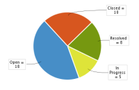
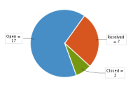
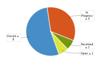
Within a given project the colors of a pie chart change their meaning, particularly if a pie chart reports out status based information. I have a status board showing pie charts of various aspects of a broad effort. Filtering on the total effort, or one of the two aspects results in three separate pie charts where the colors map to different statuses! This makes the pages significantly less easy to interpret.
The current implementation appears to assign colors based upon the magnitude of various aspects of the project, which might be fine for filtering on other things, but on status it makes multiple pie charts on the same page difficult. A fix for this would be to assign colors based upon the order the statuses are enumerated... in such a way the statuses wouldn't change from one chart to the next, and you could again interpret the charts as "too much blue" or "all green means everything is closed", etc.
Some examples follow.
- is related to
-
CONFSERVER-41625 JIRA Chart (Pie Chart) Colors Change Meaning
- Closed
- mentioned in
-
Page Loading...


