-
Type:
Suggestion
-
Resolution: Unresolved
-
None
-
8
-
2
User Problem
According to https://confluence.atlassian.com/cloud/blog/2024/01/atlassian-cloud-changes-jan-8-to-jan-15-2024, under the Identify issues with card colors section:
Add a color to your issues to quickly identify your work. Colors can be based on a Jira query, issue type, priority, or assignee.
This is a refreshed experience — the modernized UI is also more accessible and it adopts the global Jira color picker, decked out with a palette of recommended hues.
The color palette is a standard way in Jira software to allow users to pick colors for a given context such as Parent Field (Epic) color and colors for timeline / roadmap issues.
However, the recommended colour palette may not give enough colours. And in some edge cases, users can't visually tell the difference between colours when viewing cards on the board or backlog.
Suggested Solution
- Explore more accessible solutions for the card experience itself.
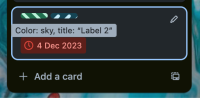
- Some initial ideas consider adding patterns so visual aid don't just rely on colours (Trello example attached). Adopting this solution requires further exploration around pattern selection in settings, and adaption of card layout so the patterns are visible on the board and backlog view.

Workarounds
- In card colour settings, try to pick colors from the recommended color palette from the same row, rather than choosing colors that are variations of the same shade to help make it easy to distinguish items.
