• 16
    • 28
    • Our product teams collect and evaluate feedback from a number of different sources. To learn more about how we use customer feedback in the planning process, check out our new feature policy.

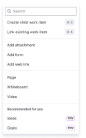
      The Quick actions menu has recently been updated to show a more compact version and this opens the way for now having more space in the UI. It would be good to be able to utilize this space by being able to pin actions so that they are not collapsed under the "Add" button, and immediately accessible at all times.

      • Allowing the administrators to set some default pinned actions on a Project-issue type level, while also allowing users to pin the actions they want on an user account level would give even more flexibility.

      Original Description

      The Quick actions menu has recently been updated to show a more compact version. This style is not be optimal for all teams and scenarios, and it would be good to have a way to toggle/choose which version to use.

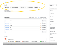
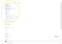
      For context, the old style looked like this:

      And this is how it looks now:

          Form Name

            [JRACLOUD-85131] Allow choosing the Quick actions style

            Adam Janecke added a comment - - edited

            2239430e27fb I think if there absolutely needs to be a change to be more minimal footprint on the main ticket view, another idea would be to have the "Add button" be a hover over effect that then drops down into a mega menu to show all the options and applications, so then you have one less click and you find everything all in one place instead of having two separate buttons (Add Button and the Apps buttons).

            Adam Janecke added a comment - - edited 2239430e27fb I think if there absolutely needs to be a change to be more minimal footprint on the main ticket view, another idea would be to have the "Add button" be a hover over effect that then drops down into a mega menu to show all the options and applications, so then you have one less click and you find everything all in one place instead of having two separate buttons (Add Button and the Apps buttons).

            Lara Bailey added a comment -

            Ditto to Rune's comment - I have keyboard shortcuts turned off because too many times unexpected things happen.
            Ditto to everyone else's comment - only power users (who don't have the problem Rune and I have) use keyboard shortcuts. The main complaint that we all have is that actions that are performed regularly and that admins work hard to have users remember to do NEED TO BE VISIBLE.

            Lara Bailey added a comment - Ditto to Rune's comment - I have keyboard shortcuts turned off because too many times unexpected things happen. Ditto to everyone else's comment - only power users (who don't have the problem Rune and I have) use keyboard shortcuts. The main complaint that we all have is that actions that are performed regularly and that admins work hard to have users remember to do NEED TO BE VISIBLE.

            Rune Rasmussen added a comment -

            I think keyboard shortcuts should be a complement, and not the primary way of doing an action.

            As others point out, many users don't know about keyboard shortcuts, or just aren't using them.

            I myself, as an org admin, power user, and general Atlassian Cloud advocate has turned off keyboard shortcuts all together.
            Too often I found myself thinking I had selected a text field, begun typing, and then a hundred unintended things happened.

            Please prioritize actual UI buttons first and make shortcuts as a secondary.

            Rune Rasmussen added a comment - I think keyboard shortcuts should be a complement, and not the primary way of doing an action. As others point out, many users don't know about keyboard shortcuts, or just aren't using them. I myself, as an org admin, power user, and general Atlassian Cloud advocate has turned off keyboard shortcuts all together. Too often I found myself thinking I had selected a text field, begun typing, and then a hundred unintended things happened. Please prioritize actual UI buttons first and make shortcuts as a secondary.

            Jef Verheyden added a comment -

            2239430e27fb 
            I think you then should find a place for them in the new side bar navigation rather than in the topmenu.
            Most of our users dont even know shortcuts exist.
            They need visible buttons they can click on.

            Jef Verheyden added a comment - 2239430e27fb   I think you then should find a place for them in the new side bar navigation rather than in the topmenu. Most of our users dont even know shortcuts exist. They need visible buttons they can click on.

            Graham Douglas added a comment -

            keyboard shortcuts are not of any use for the majority of Jira users. Most people who use Jira probably do so to get a job done, rather than frequently and considered enough to remember shortcuts. It is kind of the same reason hiding these quick actions also doesn't work - most users need key actions front and centre.

            My recommendation would be to offer 'sticky' quick action that appear 'old style' across the top rather than in the drop down. The sticky options should also be rolled out with certain actions defaulted to sticky, such as 'Attachment', 'Subtask', 'Linked Issue' and 'Weblink'. Then its only when a Jira instance starts adding all sort of extra apps to the menu that the admin needs to consider what should be sticky and what shouldn't.

            Graham Douglas added a comment - keyboard shortcuts are not of any use for the majority of Jira users. Most people who use Jira probably do so to get a job done, rather than frequently and considered enough to remember shortcuts. It is kind of the same reason hiding these quick actions also doesn't work - most users need key actions front and centre. My recommendation would be to offer 'sticky' quick action that appear 'old style' across the top rather than in the drop down. The sticky options should also be rolled out with certain actions defaulted to sticky, such as 'Attachment', 'Subtask', 'Linked Issue' and 'Weblink'. Then its only when a Jira instance starts adding all sort of extra apps to the menu that the admin needs to consider what should be sticky and what shouldn't.

            Ahmud Auleear added a comment - - edited

            Hey Everyone, 

            Thank you for your feedback. 

            We have moved to the dropdown menu for scalability and performance reasons. 
            We are exploring solutions to the feedback on this ticket.

            One idea is to introduce keyboard shortcuts to our most popular objects. 
            We welcome feedback on this possible change to address the feedback on this ticket.

            Ahmud Auleear added a comment - - edited Hey Everyone,  Thank you for your feedback.  We have moved to the dropdown menu for scalability and performance reasons.  We are exploring solutions to the feedback on this ticket. One idea is to introduce keyboard shortcuts to our most popular objects.  We welcome feedback on this possible change to address the feedback on this ticket.

            Please develop this ASAP! Wild that you would just push out a UI change without any proactive messaging to admins/users, and then at the same time provide zero methods to opt-out! It's like the product owner(s) that pushed for this change doesn't actually use Jira! Freakin' wild.

            Jared Moore added a comment - Please develop this ASAP! Wild that you would just push out a UI change without any proactive messaging to admins/users, and then at the same time provide zero methods to opt-out! It's like the product owner(s) that pushed for this change doesn't actually use Jira! Freakin' wild.

            Sarah Vrla added a comment -

            I agree with others that this can add substantial time to workflows and obfuscate tools unnecessarily.

            Ideally, it would be possible to toggle whether these are present to all users as individual buttons and for each user to be able to toggle their own layout as well. Something similar to how users can pin their own selection of fields in the sidebar.

            Sarah Vrla added a comment - I agree with others that this can add substantial time to workflows and obfuscate tools unnecessarily. Ideally, it would be possible to toggle whether these are present to all users as individual buttons and for each user to be able to toggle their own layout as well. Something similar to how users can pin their own selection of fields in the sidebar.

            Please make this configurable by the user, so we can prioritise the actions we use most, and have the rest under " Add more..." or similar.

            Also, as a side-note, the blinking border around the "+ Add" button is extremely irritating when I'm typing in the card. Having a blinking UI elements in a productivity application should have been outlawed decades ago!

            Neal McConachie added a comment - Please make this configurable by the user, so we can prioritise the actions we use most, and have the rest under " Add more..." or similar. Also, as a side-note, the blinking border around the "+ Add" button is extremely irritating when I'm typing in the card. Having a blinking UI elements in a productivity application should have been outlawed decades ago!

            This is a great idea. We're in an environment with more apps than my previous company and so decluttering the menu is welcome, but I do appreciate that some companies do not have the same challenges. 

            Michele Colson added a comment - This is a great idea. We're in an environment with more apps than my previous company and so decluttering the menu is welcome, but I do appreciate that some companies do not have the same challenges. 

              2239430e27fb Ahmud Auleear
              rchiquete Rene C. [Atlassian Support]
              Votes:
              68 Vote for this issue
              Watchers:
              58 Start watching this issue

                Created:
                Updated: