-
Type:
Suggestion
-
Resolution: Answered
-
None
-
Component/s: Dashboard & Gadgets
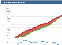
Currently, the Created vs. Resolved chart shows just that - a comparison of newly created issues vs. the number that are resolved. It would be nice if there was an option to included re-opened tickets as well. If there are a considerable number of re-opened tickets, you eventually run into "negative" situations (see attached "Created vs. Resolved.gif" for a real example). Note that this example goes back to the beginning of the project (so there were no issues at all on the far left of the chart). In this case (where the entire project history is included), we really should never have more issues resolved then created.
Note that I originally created this in the charting plugin JIRA instance (JCHART-356), but realized that this chart is now officially part of JIRA.
