Summary
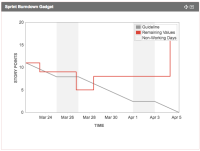
When using the burndown chart, the line can be obscured by the legend. As a scrum master, I would like the burndown legend to be moved off the chart so I can see the burndown (or should I just say "burn" - not so much "down") line no matter how poorly the team is doing.
See attached a screen shot of three charts laid out side-by-side on a three-column dashboard. You can see how the legend is covering the red burndown line on two of the three charts.
Steps to Reproduce
- Start a sprint with some issues assigned
- Log work/change scope in the sprint such that the line goes to the top right corner of the chart
Expected Results
The line should not be obscured by the legend.
Actual Results
The line is obscured as per the summary.
Suggestions
The legend could be an on-off toggle since most people who are looking know what they are looking at.
The legend could display in that unused white space below.
Legend could be a "tool tip" (not good for wallboards)
- Would love to see the left column on the main dashboard page (that copies the same list of dashboards in the pulldown) go away, to give more horizontal space on the dashboard page, and this could have an effect on whether the line is covered.
- Would love the option to hide non-working days (like there used to be, and is on the board page).
- Often used the old option to hide the guideline as well. (Less confusing for the higher-ups.)
- was cloned as
-
JRACLOUD-90127 Legend on the Agile Sprint Burndown Gadget covers red burndown line
-
- Closed
-
