• We collect Confluence feedback from various sources, and we evaluate what we've collected when planning our product roadmap. To understand how this piece of feedback will be reviewed, see our Implementation of New Features Policy.

      In the new 2.6 theme, the h2. and h3. headings are undistinguishable. There needs to be a bigger difference in font size, or other typography.
      This is purely by my eyes, but also confirmed by several others at my company.
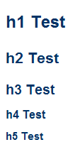
        1. heading-styles.png
          heading-styles.png
          4 kB
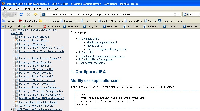
        2. screenshot-1.jpg
          screenshot-1.jpg
          209 kB

            [CONFSERVER-9954] h2 and h3 are too similar in Confluence 2.6

            No work has yet been logged on this issue.

              rericson Ryan Ericson [Atlassian]
              9f7dc9981cd2 Jon Nermut
              Votes:
              14 Vote for this issue
              Watchers:
              7 Start watching this issue

                Created:
                Updated:
                Resolved: