• We collect Confluence feedback from various sources, and we evaluate what we've collected when planning our product roadmap. To understand how this piece of feedback will be reviewed, see our Implementation of New Features Policy.

      Problem

      Confluence doesn't feel modern, while some of its competitors are ahead in this regard.

      Fix

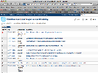
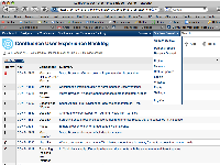
      Small visual improvements over time can slowly make Confluence contemporary. One such fix is to put a subtle gradient and shadow onto the Confluence header like so:

      This will also require the header to be made 29px high.

      Quick code solution by Chris Broadfoot:

      #poweredby {
      	padding-top: 10px !important;
      }
      
      #header {
          background-image: url(http://extranet.atlassian.com/download/attachments/673088317/gradient-header.gif);
          background-position: bottom;
      }
      
      #main {
      	border-top: none !important;
      	padding: 10px !important;
      	margin-left: -10px !important;
      	margin-right: -10px !important;
      	background: white url(http://www.ibm.com/i/v16/t/sprites-t1.gif) repeat-x scroll 0 -814px;
      }
      

      Reason for severity

      The header is everywhere.

        1. design_with_menu.png
          design_with_menu.png
          227 kB
        2. design.png
          design.png
          210 kB
        3. gradient.png
          gradient.png
          0.4 kB
        4. shadow.png
          shadow.png
          0.1 kB

            [CONFSERVER-14617] Put a slight gradient into the Confluence header bar

            Closed as per Stephen's last comment.

            edith (Inactive) added a comment - Closed as per Stephen's last comment.

            Yep, happy to close this.

            Stephen Russell [Atlassian] added a comment - Yep, happy to close this.

            we're not going to this for now, unassigning the fix-for version

            Per Fragemann [Atlassian] added a comment - we're not going to this for now, unassigning the fix-for version

            Needs to be part of a larger UI change, apparantly

            Per Fragemann [Atlassian] added a comment - Needs to be part of a larger UI change, apparantly

            Reviewed this small change. I like the modern theme, I wish it was default.

            m@ (Inactive) added a comment - Reviewed this small change. I like the modern theme, I wish it was default.

            Assigning this to you since Chris is no longer.

            Stephen Russell [Atlassian] added a comment - Assigning this to you since Chris is no longer.

              Unassigned Unassigned
              srussell Stephen Russell [Atlassian]
              Votes:
              0 Vote for this issue
              Watchers:
              1 Start watching this issue

                Created:
                Updated:
                Resolved: