-
Suggestion
-
Resolution: Fixed
-
None
Currently we use dark blue color for a failed test. It's not contrast enough compared to the green one.
Furthermore, we use a red background for a "FAIL" status label, which is not consistent. Also, a green background used for a "PASS" label is different from the green dot in the icon.
Current colors used: green-pass, blue-fail, red-error are the same as in Eclipse's JUnit view.
Consider also changing a dot to three different figures to make it accessible for color-blinded people. For instance:
- light green circle - pass
- dark blue triangle - fail
- red square - error
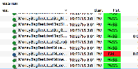
Not changing the green background for the "PASS" label - new green dot (it's a derivative of the ADG base green color - with higher saturation) is nearly identical as the text background.
I'm not changing the red background for "FAIL" label. A reason is that we use red-green color scheme on the Clover Dashboard for test passes/failures. Changing to blue would make it inconsistent. Furthermore, blue-gray scheme is used for covered-uncovered bars on a dashboard.
So we'll stay with a blue triangle in the icon (to be consistent with a blue test fail icon in the JUnit view) and at the same time with a red "FAIL" text (to be consistent with a Clover dashboard as well as code coloring in editor tabs).